Analyzing and monitoring floods using Python and Sentinel-2 satellite imagery on EO-Lab
We will be focusing on obtaining images of the areas affected by the flood in Central Greece in September 2023.
Prerequisites
No. 1 Hosting
You need a EO-Lab hosting account with access to the Horizon interface: https://cloud.fra1-1.cloudferro.com/auth/login/?next=/.
No. 2 Installing Jupyter Notebook
The code in this article runs on Jupyter Notebook and you can install it on your platform of choice by following the official Jupyter Notebook install page.
One particular way of installing (and by no means being required to follow up this article), is to install it on Kubernetes cluster. If that is the case, this article will be useful:
Installing JupyterHub on Magnum Kubernetes Cluster in EO-Lab FRA1-1.
No. 3 Use Data Explorer
Satellite data for flood analysis will be obtained from the platform, which offers a variety of satellite products from various time ranges. These products come from different programs, such as Sentinel or Landsat. Users on EO-Lab can search for products and filter them by time range, location, or product name. The repository contains images from different time periods around the world.
The following articles explain the basics of working with Data Browser:
/cuttingedge/How-to-Login-to-Data-Explorer-on-Creodias-Cloud.
/cuttingedge/How-to-Download-a-Single-Product-Using-Data-Explorer-on-Creodias-Cloud.
/cuttingedge/Processing-Products-with-Data-Explorer-on-Creodias-Cloud.
Step 1 Selecting the appropriate images
The first step after downloading the products is selecting the appropriate images. For MNDWI analysis, we will need satellite images operating in the visible range of the spectrum, typically with
wavelengths between 490 to 610 nanometers (GREEN, BAND 3), as well as in
the Short-Wave Infrared (SWIR, BAND 11).
Additionally, we will use the Scene Classification Layer (SCL) to mask cloud coverage, which can influence the final result of the analysis. Afterward, we will open all images in a Python notebook.
#import libaries
import rasterio
import numpy as np
import matplotlib.pyplot as plt
from matplotlib.colors import LinearSegmentedColormap
input_band_3_b = 'band_3_before_flood.jp2'
input_band_11_b = 'band_11_before_flood.jp2'
input_scl_b = 'scl_image_before_flood.jp2'

input_band_3_f = 'band_3_during_flood.jp2'
input_band_11_f = 'band_11_during_flood.jp2'
input_scl_f = 'scl_image_during_flood.jp2'
Open raster images
def open(raster):
    with rasterio.open(raster) as src:
        raster = src.read(1)
    return raster
#Get CRS and transformation data
with rasterio.open(input_scl_f) as src:
    crs = src.crs
    transform = src.transform

band_green_b= open(input_band_3_b)
band_swir_b = open(input_band_11_b)
scl_b = open(input_scl_b)

band_green_f = open(input_band_3_f)
band_swir_f = open(input_band_11_f)
scl_f = open(input_scl_f)
Step 2 Calculating MNDWI index for chosen images
Normalize pixel values in raster images
Pixel values in raster images need to be normalized to the value between 0 and 255 range. Subsequently, we can calculate the MNDWI index value using the formula:
MNDWI = (GREEN – SWIR) / (GREEN + SWIR)
def normalize(band_green, band_swir):
    #Calculate maximum values for each raster file
    max_value = band_green.max()
    max_value = band_swir.max()

    #Normalize raster data to 0-255 scale
    scaled_band_green = (band_green / max_value) * 255
    scaled_band_swir = (band_swir/ max_value) * 255

    return scaled_band_green, scaled_band_swir
#Calculate MNDWI value for given images
def mndwi(scaled_band_green, scaled_band_swir):
    mndwi = (scaled_band_green - scaled_band_swir) / (scaled_band_green + scaled_band_swir)
    return mndwi
band_green_b, band_swir_b = normalize(band_green_b, band_swir_b)
band_green_f, band_swir_f = normalize(band_green_f, band_swir_f)

mndwi_b = mndwi(band_green_b, band_swir_b)
mndwi_f = mndwi(band_green_f, band_swir_f)
Display results on matplotlib image
# Define a colormap that transitions from white to light green to blue to dark navy blue
colors = [(1, 1, 1), (0.8, 1, 0.8), (0, 0, 1), (0, 0, 0.4)]  # (R, G, B)
cmap = LinearSegmentedColormap.from_list('custom_colormap', colors, N=256)

# Create a figure and axis for the MNDWI before flood (mndwi_b) raster
plt.figure(figsize=(8, 8))
plt.imshow(mndwi_b, cmap=cmap, vmin=-1, vmax=1)  # Adjust the colormap and limits as needed
plt.colorbar(label='MNDWI')
plt.title('MNDWI Before Flood')

# Create a figure and axis for the MNDWI during flood (mndwi_f) raster
plt.figure(figsize=(8, 8))
plt.imshow(mndwi_f, cmap=cmap, vmin=-1, vmax=1)  # Adjust the colormap and limits as needed
plt.colorbar(label='MNDWI')
plt.title('MNDWI During Flood')

plt.show()
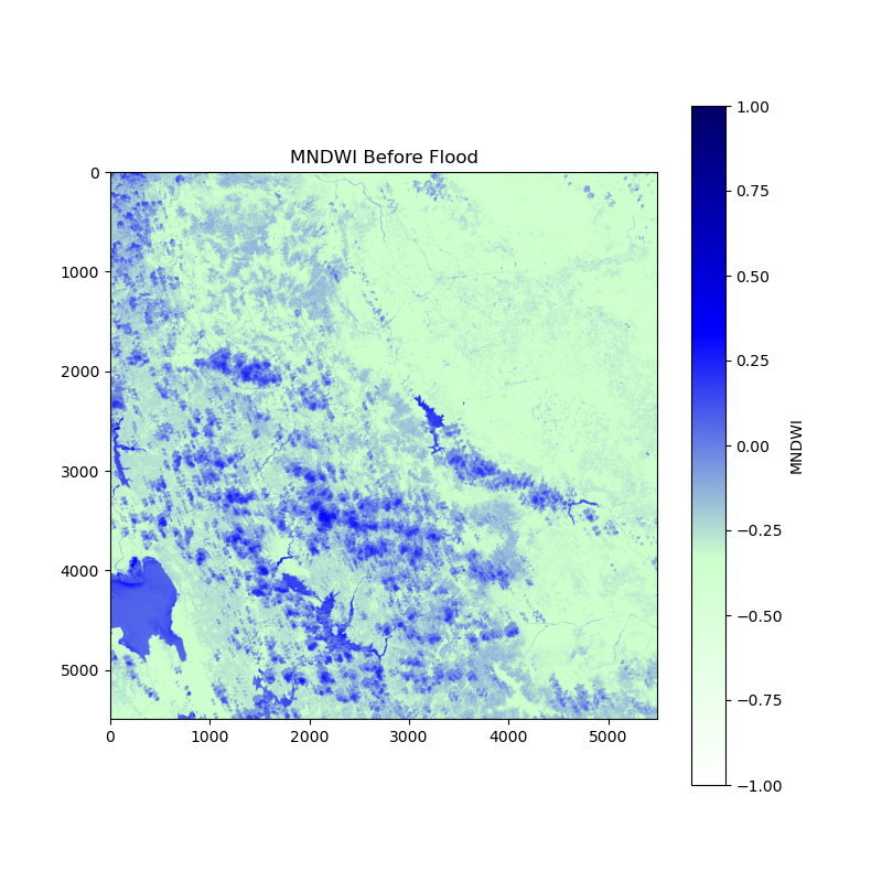
This is the image “before the flood”:
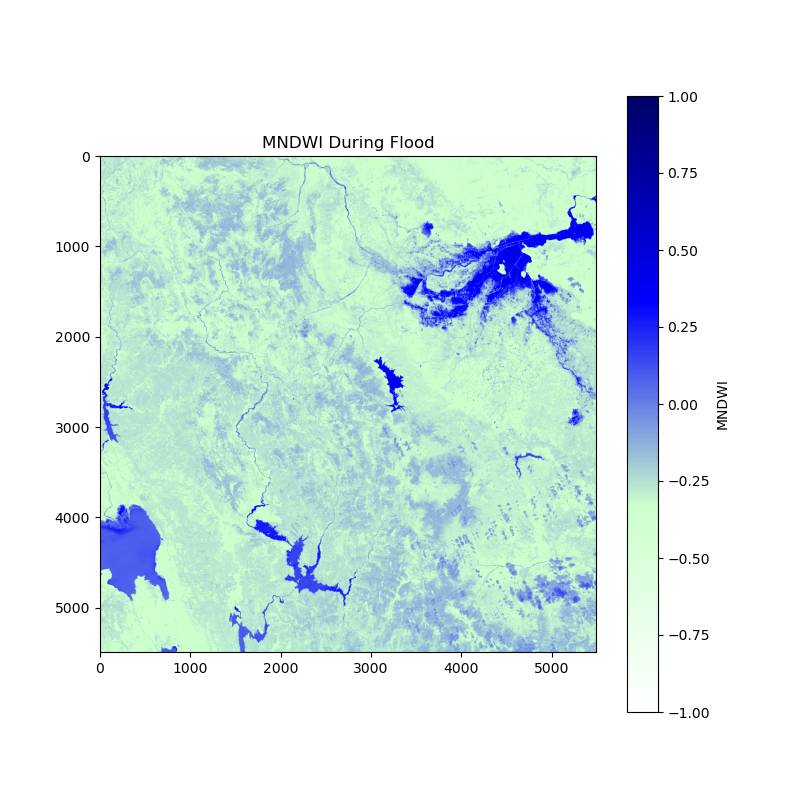
and this one is “after the flood”:
Step 3 Identifying areas with increased water presence
The next step involves making the process clearer by identifying areas with increased water presence. This will be done by subtracting the MNDWI index value before the flood from the MNDWI index value during the flood, all while simultaneously excluding areas covered by clouds. This process will result in an image that highlights regions where water presence has risen.
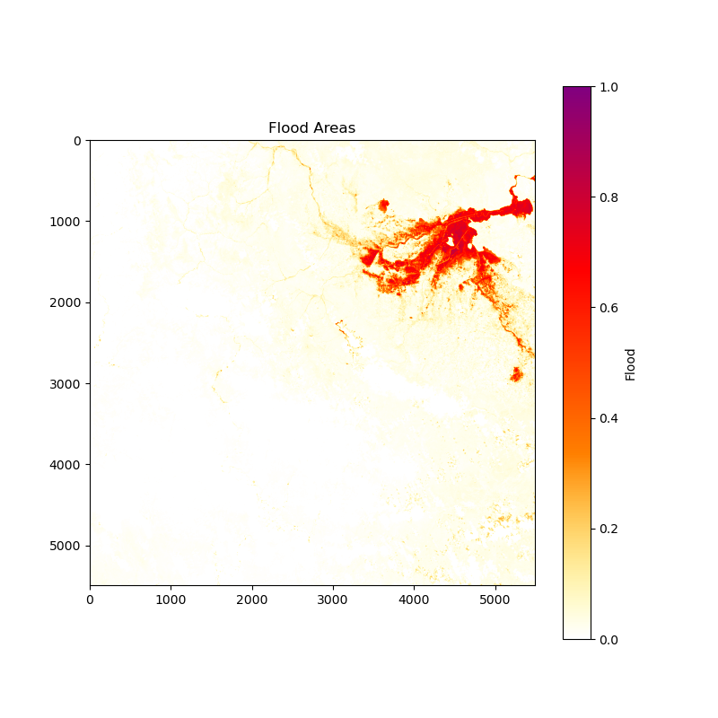
Another valuable product we can obtain is an image that specifically displays areas submerged by water during the flood. To achieve this, we will use the same calculation as in the previous step, with an additional layer of masking to exclude areas that had a positive MNDWI index before the flood. This will create an image that shows areas currently containing water which did not contain it before.
#Create mask by SCL values
mask_f = np.logical_or(scl_f == 8, np.logical_or(scl_f == 9, scl_f == 3))
mask_b = np.logical_or(scl_b == 8, np.logical_or(scl_b == 9, scl_b == 3))
#Calculate difference between flood period and normal period
diff = mndwi_f - mndwi_b

#Calculate water tides by showing the pixcels that have positive difference values
tide = diff
tide[(diff < 0)] = 0
tide[mask_f | mask_b] = 0
tide = tide / tide.max()
#Calculate flood areas by showing the pixcels that have possitive difference values and had negative values of MNDWI before flood
flood = diff
flood[(diff < 0) | (mndwi_b > 0)] = 0
flood[mask_f | mask_b] = 0
flood = flood / flood.max()
Display results on matplotlib image
# Define a colormap that goes from yellow to red with transparency for 0 values and violet for high values
colors = [(1, 1, 0, 0), (1, 0.5, 0, 1), (1, 0, 0, 1), (0.5, 0, 0.5, 1)]  # (R, G, B, Alpha)
cmap = LinearSegmentedColormap.from_list('custom_colormap', colors, N=256)

# Create a figure and axis for the Water Tides raster
plt.figure(figsize=(8, 8))
plt.imshow(tide, cmap=cmap, vmin=0, vmax=np.max(tide))  # Adjust the colormap and limits as needed
plt.colorbar(label='Tide')
plt.title('Water Tides')

# Create a figure and axis for the Flood Areas raster
plt.figure(figsize=(8, 8))
plt.imshow(flood, cmap=cmap, vmin=0, vmax=np.max(flood))  # Adjust the colormap and limits as needed
plt.colorbar(label='Flood')
plt.title('Flood Areas')

plt.show()
Image for Water Tides:

Image for Flood Area:
Download the resulting images
The last step will be downloading the resulting images using the Rasterio library:
def save(raster, name):
    with rasterio.open(f"{name}.tif", 'w', driver='GTiff', width=raster.shape[1], height=raster.shape[0], count=1, dtype=raster.dtype, crs=crs, transform=transform) as dst:
        dst.write(raster, 1)
save(mndwi_b, 'mndwi_before_greece')
save(mndwi_f, 'mndwi_flood_greece')
save(tide, 'tide_greece')
save(flood, 'flood_greece')
What To Do Next
The following article uses similar techniques for processing Sentinel-5P data on air pollution:
Processing Sentinel-5P data on air pollution using Jupyter Notebook on EO-Lab.